Love Your Videographers: Advice to Create Successful Videos

Videos can be very effective for marketing, but they aren’t cheap to make. And low quality videos have poor return on investment. Research by the Content Marketing Institute looked at 200,000 YouTube business videos and discovered that more than 50% of them had less than 1,000 views. Many videos created by businesses and other organizations are boring, poorly made, or just blah. When investing in video, you should aim for high-quality results that support your marketing objectives.

So how do you create the best video possible for your money?

The key to creating a terrific video and having a great relationship with your video team is to get everyone the same page - and keep them there. So says the experienced team at StoryDriven, a marketing firm with a specialty in documentary-style video located in Durham, NC. The group has made videos for organizations such as Harvard Business School, CrossComm, Durham Academy, North Carolina State University, and the University of North Carolina.
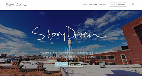
ScreenShot of the Story Driven websiteI sat down with Nathan and Bryce of StoryDriven to understand how we can do a better job of working with videographers, keep on the same page, and end up with impactful videos. Learn from them in our interview below:

What are your goals as videographers?

Bryce: We want to make sure that we are communicating the message that truly needs to be communicated. We need to take time to understand what the client is trying to say and get all the important information before we start shooting. Success often depends on the pre-production work - figuring out the right structure of the story, doing pre-interviews, and so on - you should have a clear idea of how the video should be laid out before you start producing it. This makes for an enjoyable experience.

Nathan: Also we want to be a strategic content partner that goes beyond video. For example, we can take your video and transcribe it and then you have tweets for days or weeks. We can pull still frames with quotes overlaid for easy social media posts. We want to see that your video has maximum impact, so you can reach your business goal and feel you got the most of your investment.

What things do clients do that annoy you?

Nathan: It's frustrating when we get called in, and the client has already decided on all the things that make a story good or bad. If we don’t have the chance to give input and bring our expertise as storytellers through video, we are limited from the get-go. Some clients would rather have their video vendor execute than be a collaborative partner. And we’ve realized that videographers start to expect this. But we help our clients get more out of their video when we develop ideas together. We’ve seen what works and doesn’t over many years and types of videos.

Bryce: Good communication is key to any healthy relationship. Part of that communication is aligning expectations. Assumptions about responsibilities and workload is a formula for disaster. Our job is to educate our clients and be their guide throughout the process. Take workload for example, oftentimes clients don’t realize that even a small change to a video will require us export, compress, upload and deliver it again - changes should be sent in batches so the process isn’t bogged down with a continuous stream of minor tweaks.

What do you wish clients did more of?

Nathan: Provide positive feedback along with negative feedback - that’s always nice, we are human beings too.

Bryce: Patience is important. If someone were to come to us saying, "We need this next week," that’s just not realistic for success. Video needs to be incorporated into your strategic communications plan. Give your video partner a three month window.

How much do high quality videos cost?

Nathan: It depends on the complexity of the story being told and the length of the video. It’s actually harder to make a shorter video than a longer one. There is a wide range in the industry, but the best videographers in our area might price a video with three characters anywhere from $15,000 to $50,000.

Bryce: It's always going to cost more than you think it is. If you are deciding who to use based on a bid war, you might luck out and find someone early in their career who charges less. But, you want to make sure that you are working with someone who “gets it,” wants to understand who you are and where you are coming from, and can expand upon your brand. Keep in mind that big equipment does not equal value. Value is understanding and being able to collaborate with a trusted partner.

Do you have any other advice for those hiring videographers?

Nathan: Always give your video person a deadline even if it's arbitrary. This helps us prioritize our other work and get it to you in a reasonable time. And be sure there is one contact person for us who can consolidate feedback so we aren’t getting different direction from various team members.

Bryce: If you work with someone to build a relationship, every time you do a project together it's going to get better since both parties come in with more knowledge and understanding of the situation. We love what we do and think that not only can we produce terrific videos, but the process itself can be fun for all.

Nathan: Yes, we love what we do and especially like finding partners to work with for the long-term. View your video team as a relationship, treat them like you like to be treated, and you are going to get more exciting video and care on your projects.

Thank you, StoryDriven team!

Check out some recent work by StoryDriven:

Investors' Circle - The Investor Story from StoryDriven on Vimeo.

If you have any further questions on documentary style video, you can reach out to the StoryDriven team or contact me for advice.

Do Less, Not More in 2016

“You have brains in your head. You have feet in your shoes. You can steer yourself any direction you choose.”- Dr. Seuss

Too many people in both small and large organizations create a lot of extra work for themselves. They pump out content, send a flurry of mass emails, and rapidly develop services or products. I see lots of activity without enough planning, thought, or research. This often leads to poor results. Busyness isn’t productivity.

In 2016, I hope you do less, not more. Do whatever you do with care, thought, and deliberation. Make sure what you are creating will have impact. Don’t create unnecessary work for yourself.

keep-calm-and-do-less_small.jpg

Before creating an article, a product, a service, or anything else, ask yourself critical questions such as:

  • Who is this for?
  • How do we know they want it?
  • How long will this take to make?
  • Does this help us reach our business goals?
  • Is it worth the time?
  • Do we have the time?
  • How will we measure results?

Here are my other hopes for you in 2016:

Have a communication plan for this year. It doesn’t have to be long. A one page document with goals, target audiences and key messages can be sufficient. Plan what you are doing instead of taking haphazard actions. I did my communication plan for the year the other day in an hour. Download an example of a simple communication plan template here.

Go for quality not quantity. Whatever you plan to do online, go for quality not quantity. With digital content, especially for professional services organizations, this will serve you well. I encourage you to have short headlines, clear navigation, and straightforward language. Keep it simple and meaningful. Dump the marketing fluff. Here are 5 ways to give your website some love. Or check out my 2015 website tips that are still super relevant.

Don’t guess what the people you serve want. Talk with them, ask them, and study them. You’ll be much better at delivering items that are valued. Many companies create services or products based on intuition or false assumptions. I haven't seen it work well.

Be choosy about what ideas you execute. Ideas can be a dime a dozen. Next time you have a great idea, do some research to try to confirm it. Is it really great? Are you able to do it? Is it worth the effort? Remind me to tell you about my company called Recycled Sequins sometime. Great idea (I had a awesome tagline!), never executed (it saved me hours of work and frustration.)

Aim for joy. I hope you like what you are doing with your work life. If you don’t, what can change? Life is short, the first few days of 2016 are already gone! How are you going to spend your time?

I'll be doing more UX research and content strategy this year. Let me know if I can help you.

Wishing you a thoughtful, careful, and deliberate 2016!

4 Lessons from Yoga for UX Research

For three days after each yoga class, I was sore to the point of limping. It took me two years of classes to realize that’s not how I should feel afterwards. I finally learned that my classmates were not sharing my experience. They felt great the next day. I had applied my soccer training mentality to yoga. Push harder, go farther, do more. It worked for me in soccer. Not so much in yoga. I’m still learning through yoga 15 years later. Recently I’ve thought about how it has helped me become a better UX researcher.

This is what I’ve learned:

1. Embrace silence. It’s fun to be immersed in a yoga class with music. But there are some things I only get from holding a pose in silence. In that silence I can give my full attention to my body. I can also watch my thoughts. I'm 100% present and engaged.

When I’m conducing user research interviews, the silence before a vulnerable story is told is precious. If I break that silence, I may squelch a critical insight. I must give interviewees time to breathe and think. Silence is necessary in an interview just as white space is needed on a website. I keep my mouth shut, try to get my colleagues to shut theirs, and let interviewees do the talking.

Hotasana is a great place to take yoga classes, but I'm hoping they remove their auto-rotating carousel from their homepage soon. 

Hotasana is a great place to take yoga classes, but I'm hoping they remove their auto-rotating carousel from their homepage soon. 

2. Open your mind each day. My yoga teachers remind me that just because I could do a pose yesterday doesn’t mean I can do it today. And if I couldn’t do it yesterday, perhaps today I’ll have a breakthrough. I must drop my preconceived ideas of what yoga practice will look like on any given day. When I get on my mat, I approach the practice with a curious and open mind. I don’t know how body will feel and what I will learn that day.

Likewise, when I'm interviewing, I aim to drop my biases and assumptions as much as possible. Maybe this feature isn’t in fact the right one to build next. Perhaps the website doesn’t need a total reorganization. Maybe that obnoxious stakeholder does have an excellent point.

3. Care for yourself. It’s not anyone else’s job to take care of me. It’s my job. I’m 40, not 4. Yoga teachers remind students to listen to their body and modify poses when necessary. Yoga isn’t a “push through at all costs” type of activity, it’s mindfulness practice. I can apply this to my work.

If I’m overwhelmed, tired, hungry, or angry, I need to care for myself and stop working for a bit. The UX project isn’t going to improve by “powering through” it. If I step away from the project, the next indicated step may become clear.

I also need to be in good health, mentally and physically, when I am interviewing users in order to do my best work. Getting enough sleep, taking care of bodily needs and preparing ahead of time are all necessary to succeed.

4. Practice for progress, not perfection. Yoga isn’t about achieving the perfect pose. I don’t really believe there is a perfect pose anymore. Yoga is about practicing, growing, stretching, strengthening, caring, and calming. The goal is progress.

The same is true for UX. People and devices are dynamic—perfection will always be elusive. In my job, I focus on testing UX websites or apps so we can figure out what is and isn't working. We can then make informed design decisions. Hopefully with each new adjustment, we make progress toward improving the UX.

I have much more to learn, both about yoga and UX, so I’m going to keep practicing daily.

What are you practicing each day?

Content Manager's Pledge

Here's the content managers pledge I presented at LavCon 2015: I pledge in front of my esteemed LavaCon colleagues for the superior content for which we stand,

to always have a project goal to communicate clear deadlines to provide organized feedback promptly and to treat my content authors with the care they deserve

so our one project together can become many, with unicorns and rainbows for all.

Five Business Lessons from the US Women’s National Soccer Team

ussoccer.jpg

I learned as much from playing soccer in college as I did in the classroom. I was trained in discipline, teambuilding, humility and hard work as I practiced and played consistently for those four years. These skills are more transferable to my work life than most of what I learned from my teachers (excellent as they were.) Now in a career as a content strategist and UX specialist, I continue to be inspired by the US women’s national soccer team (USWNT).

Here are five things the US soccer stars continue to teach me about business:

1. Perform no matter what’s going on outside the office. US goalkeeper Hope Solo, despite all her drama, shows up ready to play. She is 100% focused. Solo leaves her personal problems off the field. Does this mean you act like a robot at work? No. It means being fully in the present moment—not thinking about what’s happening before work or after work or at another location.

It takes practice to pull yourself back into the present moment when your mind wanders. If an outside issue is really affecting the quality of your work and ability to be present, take time off to address the situation.

2. Be authentic. Still fairly uncommon in athletics, US midfielder Megan Rapinoe has been out of the closet to the general public since an interview in 2012. Stop trying to be anything else but you—fully, completely you. Don’t copy others, and don’t suppress who you are. Find your unique identify as an employee or business, and seek the right surroundings where you can be yourself. Doing anything else leads to stress and isn’t sustainable.

3. Lose the ego. Unlike many other professional athletes, the US Women’s Soccer team members don’t seem driven by ego. Jeff Van Gundy, a former NBA coach who hosts two USWNT players as guests during their professional season, told USA Today:

“The utter lack of sense of entitlement was actually startling for me. For professional athletes, I always think about it in these terms: the most difficult diva of women’s soccer would be the easiest NBA player ever.”

In business, don’t let your ego get in the way of accepting responsibility and working together to do what needs to get done. Treat others respectfully as collaborators. Don’t demand that your way is always the right way—keep an open mind to new ideas. See what you can learn from those around you.

4. Stop complaining. A major difference between the ladies in the Women’s World Cup and professional men’s soccer players is how they act on the field. Whining to the referee, taking dives, acting hurt when not and general babyish behavior are part of the men’s game but rarely seen when the women play.

Don’t complain at work about how much stuff you have to do, your boss, or your coworkers. I remember listening to a co-worker in San Diego whine on and on about the management, and I thought, “We live in the US, you are well-educated, so go get another job if you dislike it so much.” People don’t like to listen to complaining, and it won’t help you in your career.

5. Cultivate grit. When the US team wins, it isn’t always pretty. Abby Wambach, the most prolific goalscorer to ever play for the US, will readily admit that her goals aren't necessarily lovely—but they still count. She is known for her perseverance and courage, the characteristics that combine for grit.

Showing up consistently every day, striving to be better, working hard, not giving up when things seem challenging - these characteristics pay off. More wins come from grinding work than flashy moments.

Today the USWNT team will take on Germany in the semifinal of the World Cup. Whether they win or not, they’ve once again inspired me with their hard work this tournament.

What have you learned from the USWNT?

Usability Review of a Small Business Website (Video Included)

If you aren't paying attention to usability and user experience, your business may be doomed. Currently great UX is a competitive advantage in the small business world. This advantage will be lost as more business owners realize they must meet their customers' desires, needs and expectations of the company website.

Small business websites can benefit from a professional usability review to craft a better user experience for their potential customers. While nothing replaces actual user testing, usability professionals can point to problems with a website quickly and offer suggestions to improve UX.

What is a usability review?

A usability review is an evaluation of a website, app or other user interface by a usability professional to see whether common usability best practices are being followed. A usability review is thorough and evaluates more parts of a user interface than one usability test usually can. This may lead to finding a greater number of problems. However, because usability reviews are conducted by just one person, they cannot discover all the usability issues of a user interface.

What are the benefits of a usability review?

Usability reviews:

  • Offer quick feedback on an interface as they can be conducted in 1 - 2 days
  • Are often less expensive and time-consuming than user testing
  • Result in a prioritized list of usability problems as well as potential solutions

How much do they cost?

The cost for a usability review varies widely and certainly depends on the complexity of the website. I've seen some listed for $300 and others for $30,000. The less expensive ones are conducted by firms who would like your business, e.g. they want to do a website redesign. I suspect in most cases you'd be better off using an independent professional who just focuses on usability. However, many small business websites can spend $3,000 or less to get significant ROI. Usability issues are contributing factors in abandoned shopping carts and exit rates on websites.

How is a usability review done?

Here's a short example of the beginning of a usability review I recently conducted for a small business client recently. I'm talking aloud during this video so you can hear what I'm thinking. This is a small website so it only took me about an hour to review it and a couple of hours to write up a report with recommendations for the business owner.

What's next?

Next I'll be conducting usability tests with participants to explore what I saw as potential problems. However, I'll also be certain to bring an open mind because it's very typical to be surprised by users during testing. Sometimes what I you expect might be a problem isn't one, but another issue will pop up you hadn't considered. There is truly no substitute for testing users and watching what they do at your website. But a usability review is a good start for many small businesses who need to improve UX.

What can you do now to improve the user experience on your website?  What kind of help do you need?

UX Article Roundup

UX (short for user experience) is a common buzzword now— it's popping up in business magazines and newspapers regularly. Marketing and communications people* are paying attention to user experience as never before. This is great because your website users are going to have an experience at your site no matter what. Now you have two options: 1) Ignore your users and hope their experience at your website is a good one.

2) Make sure your users' experience is terrific by learning from and adjusting to them.

What do YOU think is the best thing to do? This doesn't require an MBA.

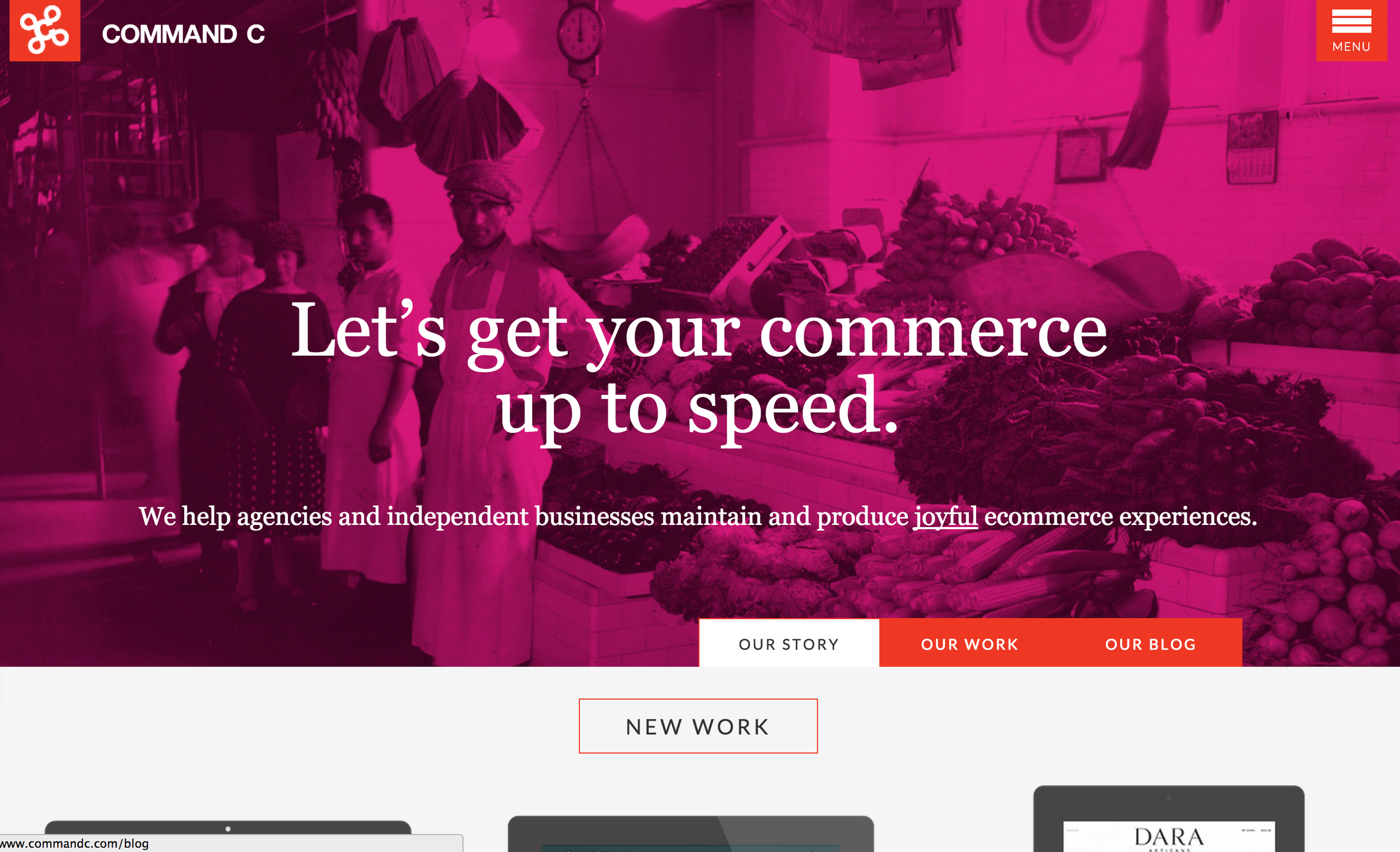
Screenshot of Command C websiteSince January, I've been writing articles on UX for a terrific web development company in New York City called Command C. I'm guessing one of the following articles probably has important information you need:

If you think you can know why your website users act as they do by just looking at at your website analytics, it's time to read this article on the importance of context.

If you think that all you must do is make your website good enough for the majority of your website users, consider designing for drunks instead. 

If you sell products online, don't miss this interview with a marketing ecommerce expert whose three websites bring in millions each year in part by focusing on user testing.

Next month I'll share with you what I learn at the Digital Marketing for Business Conference in Raleigh, where I'm speaking about Website Design with UX in Mind. Until then, I'm crossing my fingers that you choose option 2 above.

(*this group includes you if you own or manage a website)

5 Important Things Photojournalists Can Teach Website Managers

NPPA_new_logo.jpg

One photojournalist in Iraq narrowly avoided death by explosion when she declined to get in the first vehicle of a convoy. Another woman was mugged twice in a short trip to Africa. As I listened to these photographers speak, I thought about how easy my job is helping people improve their websites. I spent a recent weekend at the National Press Photographers Association Northern Short Course to further my multimedia storytelling and photography skills. I was awed by the amazing images that people sometimes risk their lives to get. I was also able to glean many pointers that apply to anyone who owns a website.

Here are five important things relevant for any website owner or content manager:

1. Seeing is believing. Photojournalists and videographers are providing visual evidence to give weight to facts, statistics and stories. Whether it’s the war in Syria or poverty in Tennessee, seeing images makes things real. Whatever service or product you provide, using photos and videos can have outsize impact on your viewers.

Are people’s lives transformed by your work? Get them on video talking about that. Show what their lives look like now. Is it really easy to use your product? Demonstrate that visually. If you’ve created a big happy community, give us genuine pictures of joyful people interacting on your website. Show, don’t tell, when possible. It’s so much more compelling when we can see the process and/or the results.

2. People need to get the idea from one picture. On the safer side of photography is portrait specialist Greg Heisler (pictured, right). He has shot more than 70 Time magazine covers including most celebrities you can name. Heisler explained that he makes sure that he has that one image that encapsulates the main message of the story. Although he will shoot other photos for interior pages, his audience needs to get a strong sense of that famous person by looking at one photo.

Similarly, the pictures you choose for your website, especially your homepage, have to represent what you do very well. Your photos must capture the main messages you are trying to send. People make very fast decisions about websites and move through them quickly – you often have only a few seconds to make an impression. Finding the perfect pictures for your website takes time, but it's worth it. And please, don’t use carousels (aka sliders) – users usually ignore them or find them annoying.

3. You have to have a good reason to produce something longer than a minute. This gem is from Ben Garvin, a photojournalist based in St. Paul, Minnesota. Currently I've noticed that video is a favorite content tactic. Yet attention span for viewing video is very short. Abandonment rates on video are tremendous – in fact, research from the Nielsen Norman Group states you lose 20% of your viewers within the first 10 seconds of a video.

If you are using a promotional video on your website, keep it as short as possible! Spend the money to hire a great videographer. Watch this terrific example of a well-made video created for a non-profit organization. If you have audio stories or testimonials, edit them down to be short and powerful.

4. It's important to avoid jarring the viewers. This idea came from photojournalist John Kirtley of Asheville, North Carolina, as he explained his editing process. (You can see a particularly inspiring news video he produced below.) He really keeps viewers in mind and is careful not to startle them as he puts together his stories. You need to apply the same idea to your website.

Pop-up windows, auto-playing music or videos and even anchor links can startle website users. These are not the kind of surprises we enjoy, yet I encounter them regularly. If you aren’t sure if something is jarring, try it out on a few honest friends. Check out their reaction to make sure you aren’t hindering instead of helping your website users.

5. People remember what they feel. If something makes you smile or feel some sort of emotion, you pay attention to it, Kirtly explained in his session “Making the Most of the Mundane.” Keep this idea in the forefront of your mind as you plan your website - how are you making your users feel?

Improving user experience for website visitors is on the rise but remains a competitive advantage. Your focus should be on your website user. Help them feel trust, ease and happiness when they visit your site. Can they accomplish their goals quickly and easily? Is it possible to delight them along the way? MailChimp does a great job of this with not only with a great product but also a high-fiving monkey after you send out an email blast. It’s a small but memorable touch that puts a smile on my face.

You don’t have to risk your life to help your website users, you just need to pay better attention to them. Channel your inner photojournalist, and start now.

For some extra inspiration check out this video produced by John Kirtley:

Snow Down, Slow Down

Handprint in SnowAs much as I dislike the cold weather, when snow falls, we all slow down here in the South — and that I secretly love. We have to pause because most of us don’t have experience driving in snow, and our area isn’t well prepared for “wintry mix” or serious snowstorms. There’s usually a flurry of activity at the grocery store in the 24 hours before a storm, but then a hush falls over the town I live in.

There is great value in this forced slowing down.

When I think about websites, content and technology, I deeply believe the best experiences don’t come from hurrying. I’m not just talking about the final results — perhaps a beautiful, responsive website — but also the process for the people who create these things.

There is a quote I love that I refer to often:

“We live by slowing down and saying with our lives that the world will not be saved by frantic activity.” – Stanley Hauerwas, theologian, Duke University

This is written on top of my digital to-do list. When I’m hurrying to create content, it’s not fun. It's evident in the final product. I do better work when I listen, consider, reflect, reconsider, then act.

Especially on social media, it can feel like lot of pressure to produce things quickly – for example, another blog post or more tweets. “Don’t just sit there, do something!” sometimes seems to be the message.

But when I look at the people and organizations I really value, they aren’t bombarding me with information or running around like chickens with their heads cut off. Two examples come to mind:

  1. Smashing Magazine who only emails me once a month with a newsletter. I look forward to it because I know it will have thoughtful, interesting and useful content in it.
  2. Twitter member and usability expert Steve Krug tweets every few days or less. I like reading what he tweets out, and I don't need him to tweet 5 times a day.

Much of the time on Twitter and other online spaces, there are organizations and people spewing information about nothing of value. If I came across these overly talkative folks at a party, I would likely scoot to the other side of the room.

Now you can be that person at the party who talks all the time to hear themselves talk, or you could be the person who speaks up less frequently, more deliberately and more thoughtfully. At least for many professional service businesses and organizations, the second option may serve them best (e-commerce might be another story). I value those people who are ok with the silence and the slowing down, who trust that frantic activity isn’t going to make our websites better or our lives better or the whole world better.

I vote we slow down more frequently to do more impactful work and have more meaningful conversations. We can make this world a better place to be.

Let it snow!

A Letter to Content Marketing People

Dear Content Marketing People, I’m so bummed to be writing this, but someone needs to call this to your attention.

Cover of Content Marketing MagazineIf you had been watching me over the winter holidays, you would have seen me peacefully reading the December 2014 Issue of Chief Content Officer magazine published by the Content Marketing Institute. But then I read this advice on page 17:

"Consider incorporating carousels or sliders - old standbys that remain effective for promoting content."

NO!

Stunned. I flip over magazine to check the date, yes, it's December 2014. Go back and re-read. This can't be right.

I too was a big fan of carousels (sliders) – in 2009. Because I worked for a big organization, many groups wanted to be on the homepage. Carousels solved my problem. I was no longer forced to prioritize my organization's homepage content or tell anyone “No, I'm sorry, I’m not putting you on the homepage and here's why . . .” It was the easier, softer way. For that reason alone I should have known the carousel solution would backfire.

In 2012 the usability and accessibility experts started to speak out against carousels. Loudly. Multiple times. All over the place. They referenced usability and user experience research. One fine gentleman even bashed carousels by creating a carousel. I love that. The bottom line is that carousels are user-UN-friendly, frustrating, and ignored. That is not an opinion - this statement is based on research.

Now content marketing folks, you aren't alone in the carousel fan club that remains in 2015. I was brought to a non-profit conference to speak last October and did a lot of research ahead of time prepare for the talk. I learned that carousels are very common on non-profit websites. Some conference attendees did not like it when I strongly recommended against using carousels. "When you said that about carousels, I wanted to slap you," said one non-profit executive. Then she scornfully asked me what she should put on her homepage instead of a carousel (as if that were the only choice!), and I suggested one image, an information graphic, a video or some other kind of content, depending on what would be most useful to her target audience.

If you are really considering your users - the people you want to help, impress, partner with and/or sell to - carousels are NOT a good solution.

So, Content Marketing People, I beg you:

Stop encouraging the use of carousels!


And please take one of the following actions so you don’t make an error like this again:

  1.  Watch this video of a talk I gave at a recent WordPress WordCamp about to learn usability principles. Go straight to 43:18 to hear about carousels.
  2. Sign up for the weekly e-newsletter from the Nielsen Normal Group - it’s free. They reference old and new usability research studies each week.
  3. Make a column on TweetDeck for the hashtag #usability and/or #userexperience.
  4. Get some friends in the usability and user experience community. They have good information and are nice folks.

Usability is like gravity, even if you know nothing about it or want to ignore it, you will still fall flat on your face if you don’t pay attention to it. Usability can help content marketing or it can hurt it, but it can’t be ignored.

Contact me anytime to talk about usability issues. I'm here to help. Together let's make the web a better place for all.

Sincerely, Melissa

Focus on Author Experience (AX) for Great User Experience (UX)

Author experience (AX) is a critical factor that affects user experiences on websites — particularly for decentralized organizations like universities. In case you aren’t familiar with AX in terms of websites, you could think of it like this: Author experience includes all aspects of content authors’ interactions both with the website and the managers at an organization.

AX is a priority for decentralized organizations such as universities that have many different groups publishing websites and content. And sometimes the content development landscape in higher ed looks like this:

Content Landscape in Higher Ed

Helping content authors get on the same page about goals, quality, and style is essential to avoid an inconsistent and confusing user experience.

Three things that can improve AX:

  1. Training on writing, photo, and video because nobody wants to feel over their head
  2. A style guide so that there is consistency on the website
  3. Page level content strategy, since having objectives and a goal for each page leads to smarter content decisions

All three are important, but I see page level content strategy as the key to helping content authors (I’m assuming there is already a communications plan in place for the organization). For example, in a decentralized environment, it’s much easier to fix formatting issues missed (ignored?) in the style guide than to get someone to remove poor content. Once content is up online, there is something sticky about it – it’s often hard to get rid of since people are now invested and accustomed to it.

More on page level content strategy in my next post coming in January!

If you are a content author in higher ed or another decentralized organization, how can you start a conversation about what you need? And if you are a manager, what could you do to improve AX (in order to improve UX) in 2015?